ATOMIZE
Library for creating atomic react components
Inspired by Tachyons and Styled-system
Inspired by Tachyons and Styled-system
npm i
@quarkly/atomize styled-components
Support for hover and any other pseudo-classes
Short aliases for each property
Minimalistic interface
Opportunity to create components that support atomic CSS and themes
Opportunity to set styles for specific media breakpoints
Option to use variables from the theme in composite CSS properties
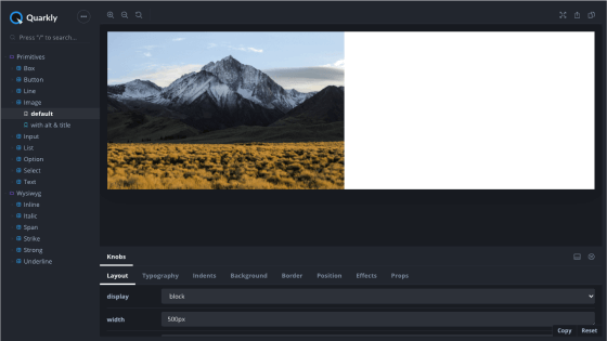
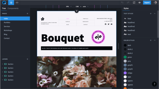
Atomize is the basis for Quarkly.io components
Quarkly is a design tool for creating websites and web apps, using components, react.js, and atomic CSS.
Atomize allows you to set styles for a specific component depending on a breakpoint, configure their states, add variables from the theme, transfer the desired props on a special panel (Props tab), and more.